1. Linear Regression
- Regression
from sklearn import datasets, model_selection, linear_model
from sklearn.metrics import mean_squared_error

# 1. Prepare the data (array!)
diabetes = datasets.load_diabetes()   # 원래 type이 np.array()

# 2. Feature selection
diabetes_X = diabetes.data[:, 2:3]   # 2차원 공간에서 시각화하기 위해 한 열만 선택
diabetes_Y = diabetes.target

# 3. Train/Test split
x_train, x_test, y_train, y_test = model_selection.train_test_split(diabetes_X, diabetes_Y, test_size=0.3, random_state=0)

# 4. Create model object
model = linear_model.LinearRegression()

# 5. Train the model
model.fit(x_train, y_train)

# 6. Test the model
print('MSE(Training data) : ', mean_squared_error(model.predict(x_train), y_train))
print('MSE(Test data) : ', mean_squared_error(model.predict(x_test), y_test))

# 7. Visualize the model
plt.figure(figsize=(10, 10))
plt.scatter(x_test, y_test, color="black") # Test data
plt.scatter(x_train, y_train, color="red", s=1) # Train data
plt.plot(x_test, model.predict(x_test), color="blue", linewidth=3) # Fitted line
plt.show()
2. Logistic Regression
- (binary) Classification
import numpy as np
import pandas as pd
import matplotlib.pyplot as plt
from sklearn import datasets, model_selection, linear_model
from sklearn.metrics import mean_squared_error, accuracy_score, roc_curve, auc

# 1. Prepare the data (array!)
df_data = pd.read_excel('boston_house_data.xlsx', index_col=0)
df_target = pd.read_excel('boston_house_target.xlsx')
df_target['Label'] = df_target[0].apply(lambda x: 1 if x > df_target[0].mean() else 0 )
boston_data = np.array(df_data)
boston_target = np.array(df_target['Label'])

# 2. Feature selection
boston_X = boston_data[:,(5, 12)] # 주택당 방 수 & 인구 중 하위 계층 비율
boston_Y = boston_target

# 3. Train/Test split
x_train, x_test, y_train, y_test = model_selection.train_test_split(boston_X, boston_Y, test_size=0.3, random_state=0)

# 4. Create model object
model = linear_model.LogisticRegression()

# 5. Train the model
model.fit(x_train, y_train)

# 6. Test the model
print('Accuracy: ', accuracy_score(model.predict(x_test), y_test))

# 7. Visualize the model
pred_test = model.predict_proba(x_test) # Predict 'probability'
fpr, tpr, _ = roc_curve(y_true=y_test, y_score=pred_test[:,1]) # real y & predicted y (based on "Sepal width")
roc_auc = auc(fpr, tpr) # AUC 면적의 값 (수치)

plt.figure(figsize=(10, 10))
plt.plot(fpr, tpr, color='darkorange', lw=2, label='ROC curve (area = %0.2f)' % roc_auc)
plt.plot([0, 1], [0, 1], color='navy', lw=2, linestyle='--')
plt.xlim([0.0, 1.0])
plt.ylim([0.0, 1.05])
plt.xlabel('False Positive Rate')
plt.ylabel('True Positive Rate')
plt.legend(loc="lower right")
plt.title("ROC curve")
plt.show()
3. KNN
- Regression / Classification
import numpy as np
import matplotlib
import matplotlib.pyplot as plt
from matplotlib.colors import ListedColormap
from sklearn import neighbors, datasets
import warnings
warnings.filterwarnings("ignore")

# 1. Prepare the data (array!)
iris = datasets.load_iris()

# 2. Feature selection
x = iris.data[:, :2]
y = iris.target

(# 3. Train/Test split)

# 4. Create model object
model = neighbors.KNeighborsClassifier(30)

# 5. Train the model
model.fit(x, y)

# 6. Test the model
model.predict([[9, 2.5], [3.5, 11]])

# 7. Visualize the model
# 그래프를 그릴 도화지의 x축과 y축의 최대/최소 값을 계산해주기
x_min, x_max = x[:, 0].min() - 1, x[:, 0].max() + 1
y_min, y_max = x[:, 1].min() - 1, x[:, 1].max() + 1

# xx & yy 는 전체 도화지 위의 x & y 좌표 순서쌍이 됩니다. (2차원 그리드 좌표 반환)
xx, yy = np.meshgrid(np.arange(x_min, x_max, 0.01), np.arange(y_min, y_max, 0.01))

# XY 좌표계 상의 각각의 Point에 대하여 KNN model 로 class prediction을 진행
# np.c_[] : 두 개의 1차원 배열을 세로로 붙여서 2차원 배열 만들기
# ravel() : 다차원 배열(array) -> 1차원 배열로 평평하게
Z = model.predict(np.c_[xx.ravel(), yy.ravel()])
Z = Z.reshape(xx.shape) # xx.shape == (220, 280)
# print(Z)
# print(np.c_[xx.ravel(), yy.ravel()])

# 도화지 위에 칠해줄 색상을 지정
cmap_light = ListedColormap(['#FFAAAA', '#AAFFAA','#00AAFF']) # x & y 좌표계 각 포인트
cmap_bold = ListedColormap(['#FF0000', '#00FF00','#0000FF']) # 실제 데이터

# 도화지 위의 x & y 좌표 각각에 대해 Cluster를 Predict한 결과를 그려주기
plt.figure(figsize=(10,5))
plt.pcolormesh(xx, yy, Z, cmap=cmap_light)

# 도화지 위의 실제 데이터 각각에 대해 색상을 칠해서 표현
plt.scatter(x[:, 0], x[:, 1], c=y, cmap=cmap_bold, edgecolors='gray')
plt.xlim(xx.min(), xx.max())
plt.ylim(yy.min(), yy.max())
plt.title("3-Class classification (k = 30)")
plt.show()
4. SVM (Support Vector Machine)
- Regression / Classification
- 보통, 하이퍼파라미터로 C, gamma, kernel을 설정한다.
- SVM의 목적은 Margin을 최대화하는 결정 경계를 찾는 것이다.
- 하지만 현실적으로 Plus, Minus plane에 약간의 여유 변수(Slack Variable)을 두는 것으로 가장 좋은 결정경계를 두기로 하였다.
- 여유변수를 포함한 목적함수를 보자.

1) 전체 식을 minimize하는 argument w, b를 찾아야 한다.
2) 1/2 (w norm)은 원래 maximize 2/(w norm)을 역수로 취해 minimize로 변형한 모습이다.
- 제곱은 미분 편의성을 위해 추가
3) 크사이는 i에 해당하는 데이터와 i의 margin과의 거리이다. 모든 여유변수들과 그에 해당하는 margin과의 거리의 총합이 시그마 크사이로 나타나져있다.
4) 마지막으로, 여유 변수의 허용의 정도가 C로 드러난다.
- C가 커지면 오분류 오차 허용도를 줄이게 된다 (엄격)
- C가 작아지면 오분류 오차 허용도를 늘리게 된다 (완화)
- Classification의 경우, linearly unseparable한 데이터를 비선형 매핑(Mapping)을 통해 고차원 공간으로 변환함으로써 분리할 수 있다.
- kernel 함수로 기존 차원보다 더 높은 차원으로 변경 (hyperparameter)
import numpy as np
import pandas as pd
import matplotlib.pyplot as plt
from matplotlib.colors import ListedColormap
# import mglearn
import custom_mglearn
from sklearn.datasets import make_blobs
from sklearn.datasets import load_breast_cancer
from sklearn.model_selection import train_test_split
from sklearn.svm import LinearSVC

# 1. Prepare the data (array!)
# 2. Feature selection
# make_blobs : Generate 100 random samples (x & y set)
X, y = make_blobs(centers=4, random_state=8)
y = y % 2

(# 3. Train/Test split)

# 4. Create model object
# 5. Train the model
linear_svm = LinearSVC().fit(X, y)

(# 6. Test the model)

# 7. Visualize the model
# 2차원 구조의 데이터 시각화
figure = plt.figure(dpi=100)
# custom_mglearn.plot_2d_separator(linear_svm, X) # Plot the linear decision boundary
custom_mglearn.discrete_scatter(X[:, 0], X[:, 1], y)
plt.grid()
plt.xlabel("Feature 0")
plt.ylabel("Feature 1")
plt.show()
# 차원을 늘려 3차원 구조의 데이터 시각화
X_new = np.hstack([X, X[:, 1:] ** 2])
from mpl_toolkits.mplot3d import Axes3D, axes3d
figure = plt.figure(dpi=100)
ax = Axes3D(figure, elev=-160, azim=-26)
# 일종의 slicing, array([False,  True, False, False, False, ... ]
mask = y == 0
ax.scatter(X_new[mask, 0], X_new[mask, 1], X_new[mask, 2], c='b',
           cmap=ListedColormap(['#0000aa', '#ff2020']), s=60, edgecolor='k')
ax.scatter(X_new[~mask, 0], X_new[~mask, 1], X_new[~mask, 2], c='r', marker='^',
           cmap=ListedColormap(['#0000aa', '#ff2020']), s=60, edgecolor='k')

ax.set_xlabel("Feature 0")
ax.set_ylabel("Feature 1")
ax.set_zlabel("Feature 1 ** 2")
plt.show()
linear_svm_3d = LinearSVC().fit(X_new, y)

# 선형 결정 경계 그리기
figure = plt.figure(dpi=100)
ax = Axes3D(figure, elev=-160, azim=-26)

# 좌표계 생성
xx = np.linspace(X_new[:, 0].min() - 2, X_new[:, 0].max() + 2, 50)
yy = np.linspace(X_new[:, 1].min() - 2, X_new[:, 1].max() + 2, 50)
XX, YY = np.meshgrid(xx, yy)

# 선형 결정 경계
coef, intercept = linear_svm_3d.coef_.ravel(), linear_svm_3d.intercept_
ZZ = (coef[0] * XX + coef[1] * YY + intercept) / -coef[2]
ax.plot_surface(XX, YY, ZZ, rstride=8, cstride=8, alpha=0.3)

ax.scatter(X_new[mask, 0], X_new[mask, 1], X_new[mask, 2], c='b',
           cmap=ListedColormap(['#0000aa', '#ff2020']), s=60, edgecolor='k')
ax.scatter(X_new[~mask, 0], X_new[~mask, 1], X_new[~mask, 2], c='r', marker='^',
           cmap=ListedColormap(['#0000aa', '#ff2020']), s=60, edgecolor='k')

ax.set_xlabel("Feature 0")
ax.set_ylabel("Feature 1")
ax.set_zlabel("Feature 1 ** 2")
plt.show()
# 추가한 차원 삭제하고, 결정경계 압착시켜 들고오기
figure = plt.figure(dpi=100)

ZZ = YY ** 2
dec = linear_svm_3d.decision_function(np.c_[XX.ravel(), YY.ravel(), ZZ.ravel()])
plt.contourf(XX, YY, dec.reshape(XX.shape), levels=[dec.min(), 0, dec.max()],
             cmap=ListedColormap(['#0000aa', '#ff2020']), alpha=0.5)

custom_mglearn.discrete_scatter(X[:, 0], X[:, 1], y)
plt.xlabel("Feature 0")
plt.ylabel("Feature 1")
plt.show()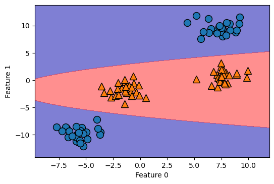
이제, SVM의 Hyperparameter 중, kernel, gamma에 집중해서 이야기해보자.
결정 경계에 나타나는 선은 사실은 엄청나게 큰 원의 일부분이다. gamma로 그 큰 원의 크기 조정하는 것

1) radial basis function(rbf): 방사 기저 함수, 가우시안 함수
- 결정결계가 가우시안 함수 분포를 따른다고 가정하는 것
2) gamma: 가우시안 분포를 따른다고 했을 때, 단면의 반지름의 역수 (1/r)
- gamma가 커질수록 r 점점 작아짐
- gamma가 작아질수록 r 점점 커짐
=> C값 커질수록, gamma가 커질수록 => Overfitting 가능성 커진다
'멋쟁이 사자처럼 AI SCHOOL 5기 > Today I Learned' 카테고리의 다른 글
| [5주차 총정리] 최적 Cluster 개수 찾기 (elbow기법, silhouette기법) (0) | 2022.04.13 |
|---|---|
| [5주차 총정리] GridSearch 코드 예시 (SVM 기반) (0) | 2022.04.13 |
| [5주차 총정리] Gradient Boosting Regression (+ Deviance graph, Feature importances) (0) | 2022.04.12 |
| [5주차 총정리] 교차 검증(Cross Validation) (0) | 2022.04.12 |
| [5주차 총정리] Ensemble 기법 종류 (Boosting 알고리즘 중심으로) (0) | 2022.04.12 |